Of course, the best option for creating a game is to hire a game development outsourcing company, but if you want to understand some of the nuances, read this article. This article will give you an overview of how to draw cool 2D graphics for games. The article is intended for those who have some familiarity with 2D gaming graphics. First of all, this applies to people who are busy with programming and want to create high-quality game resources. Next – just to all who want to create game graphics. Under 2D resources in the text means any 2D images for games: from sprites characters to large backgrounds. The article will briefly introduce the good traditional concepts of design and how they can improve your game. It is supposed to save you time and not develop bad taste.
Things like file formats, comparison of raster and vector graphics, or software used in the article examples will not be covered here.

In everyday life, we are used to seeing 2D images often. But understanding that a thing looks beautiful is not the same as knowing why it is so. Any two-dimensional image can be broken down into basic elements, so you can imagine creating two-dimensional graphics as a combination of these elements, so that: it looks like what you mean; and it’s not super ugly.
Forms
Knowing what role forms actually play, you can use them to create a friendly or unfriendly gaming environment, and to make sure that characters and objects fit (or intentionally do not fit) that environment. Start with the simplest of shapes: circles, squares and rectangles. Try to draw a character consisting only of squares or triangles, and then see which of them will be more like a hero and which one – like a villain. Keeping your original ideas in the form of sketches with simple figures, you will be able to generate many ideas without being distracted by the details.
As a rule, pointed forms contain a hint of artificiality or evil, and winding and rounded forms contain a hint of organic origin and goodness. This is the traditional range of characters. The circle and triangle are at its ends, and the square is somewhere in the middle. When a round and friendly character wanders around the sharp-angled surroundings, he looks more disturbing than the same character originally shown next to the rounded shapes. In the same spirit, you can make your own stylistic choices and thus influence the impression that the terrain makes on the player.

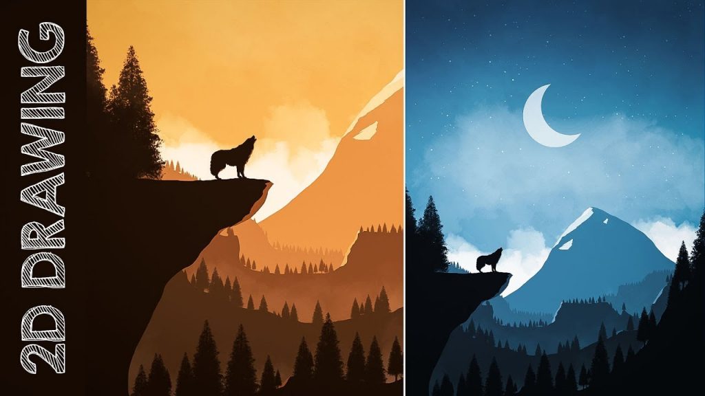
The silhouette of the object is closely related to its shape, so carelessness in choosing a silhouette can destroy the shape. If the silhouette of the character is difficult to distinguish from others, then its design is not good enough, even if you have already worked with the meaning of geometric shapes. Some artists even start drawing with a silhouette and then move in. Simplifying the object to its silhouette will help to make sure once again that it looks right.
Anatomy and proportions
The drawing of a human figure is often considered the most complex because the cartilage, muscles, bones and skin in the human body are connected in a complex way. But let’s not go into details. The basic idea is that there are certain rules and relationships for the length, size and position of the different parts of the body. This is important because anatomical errors are striking. A more stylized character, such as Mickey Mouse, may have less strict anatomy rules. But it is better to start learning with realistic figures. To break the rules, you need to know them well. Take human proportions as a basis and move towards the ideal by comparing the size of different parts of the body. Here, the easiest way is to hire a game development outsourcing company, because that’s how you’ll be able to get the best results.

